Designing specialized search systems
Over the past few years I have been working as a UX Designer and Developer for TrademarkVision, now part of Clarivate, a company that focuses on designing and developing systems to visually search for IP Rights. We have been closely collaborating with the Australian IP Office - IP Australia, that cares for examination and registration of all IP Rights in Australia, and together developed two of the offices' major search engines - Australian Trade Mark Search and Australian Design Search.
TLDR;
- Replacing 20 year old systems is challenging and very complex;
- Designing for very specialized and sometimes very opinionated users is really tough – iterating and optimising as you go is critical in these circumstances;
- Creating a legacy product, that will outlive your time within an organisation is both extremely exciting and terrifying;
- As a designer, listening to your users and learning about the field you're working in is as crucial as being good at pushing pixels – you won't go very far without the help and knowledge of everyone involved in a project this scale.
Let's begin!
IP Australia came to us with a plan - redesign and develop their existing search systems for professional Trademark, Industrial Design and Patent attorneys. The office had a set of disconnected search tools, which used different search and research patterns and they wanted to find a solution to harmonize and simplify the search experience for their customers.
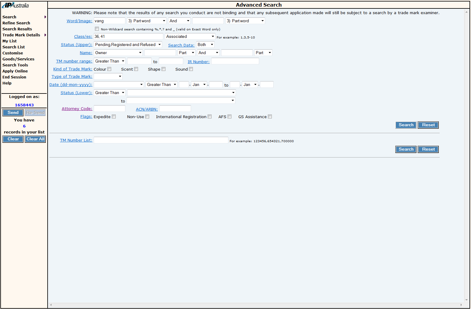
The systems we were looking at redesigning had been around for over 20 years at the time, ATMOSS (the Australian Trade Mark Online Search System) was launched in 1996 and ADDS (the Australian Design Data Search) was also about the same age. Both search engines were based off basic search forms and forced users to learn "how to search" in very particular ways – they were essentially impenetrable for new users as the learning curve for newbies was pretty steep.
Research
We started by focusing on one of the two search systems, the Trade Mark search engine, and started designing with a pretty big question in mind: What are people seeking to find when searching for trade marks?
We largely based our research on the internal processes at IP Australia, and the work that trademark examiners do when a new applications is submitted to the office and processed. We knew IP attorneys – lawyers that specialise in protecting Intellectual Property, would be using the system to conduct very similar searches and were looking for similar sets of results. However, we also knew attorneys were not solely focusing on this task when dealing with their clients and we had to ensure the system was designed to be under all circumstances.
We also had a much harder demographic, members of the general public and business owners who are more hands on and decide to submit their trademark applications, without using a third party attorney. This demographic shaped a lot of the decisions we made, especially in the early stages of prototyping.
The existing search system had two main "modes" of operation – Simple search, and Advanced search. We assumed that Simple search was designed to target the "general public" while the Advanced search mode was focused towards expert users, i.e. our attorneys. However, as we started digging further into the various functionality of the system and conducted interviews with the two user groups, we discovered that the two modes were used interchangeably, depending on the context and the type of information the users were trying to dig out of the system at a specific point in time.
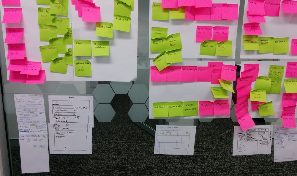
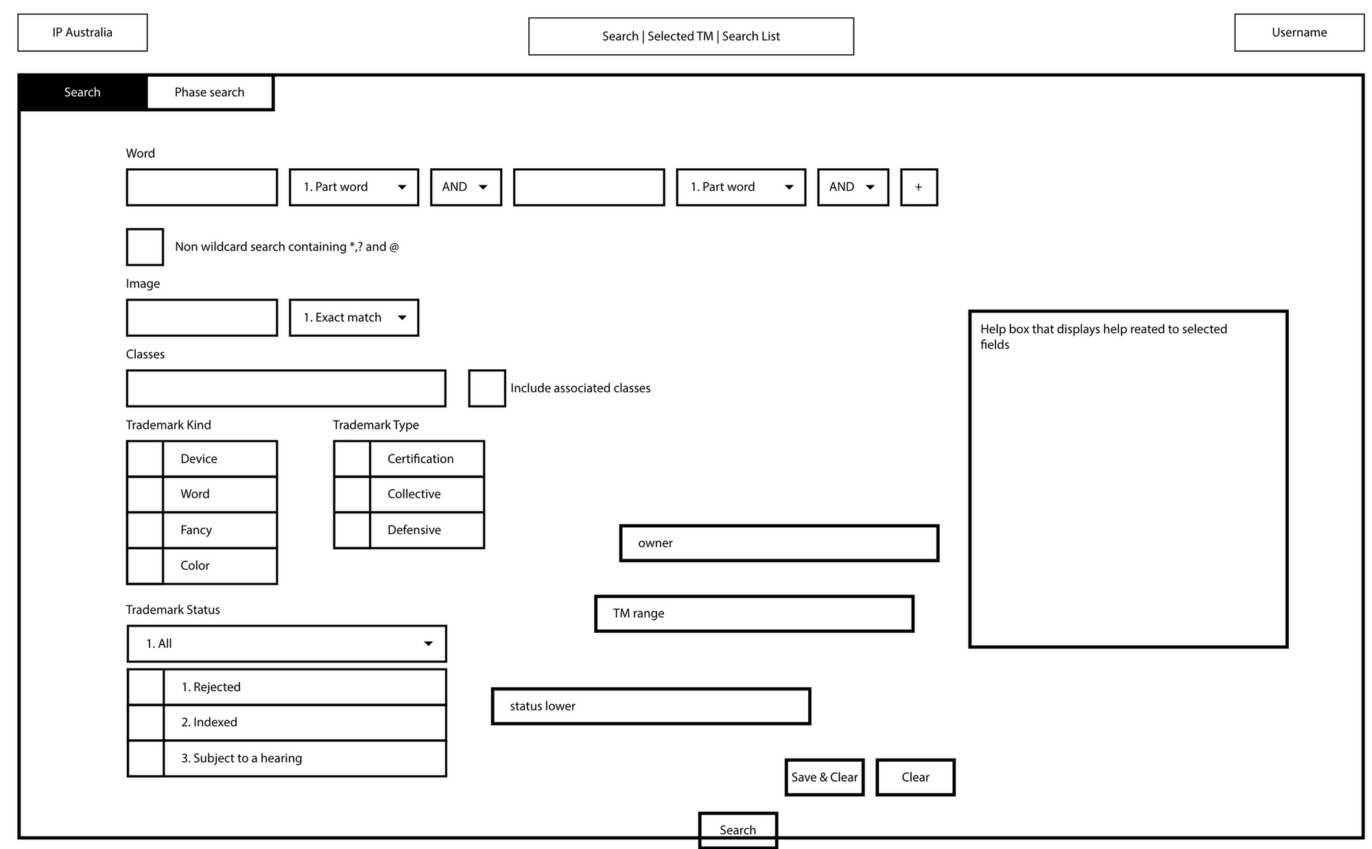
To break this down even further, we created a first set of wireframes that included the functionality our research group highlighted as the most common, and simplified the two "modes" as much as possible.
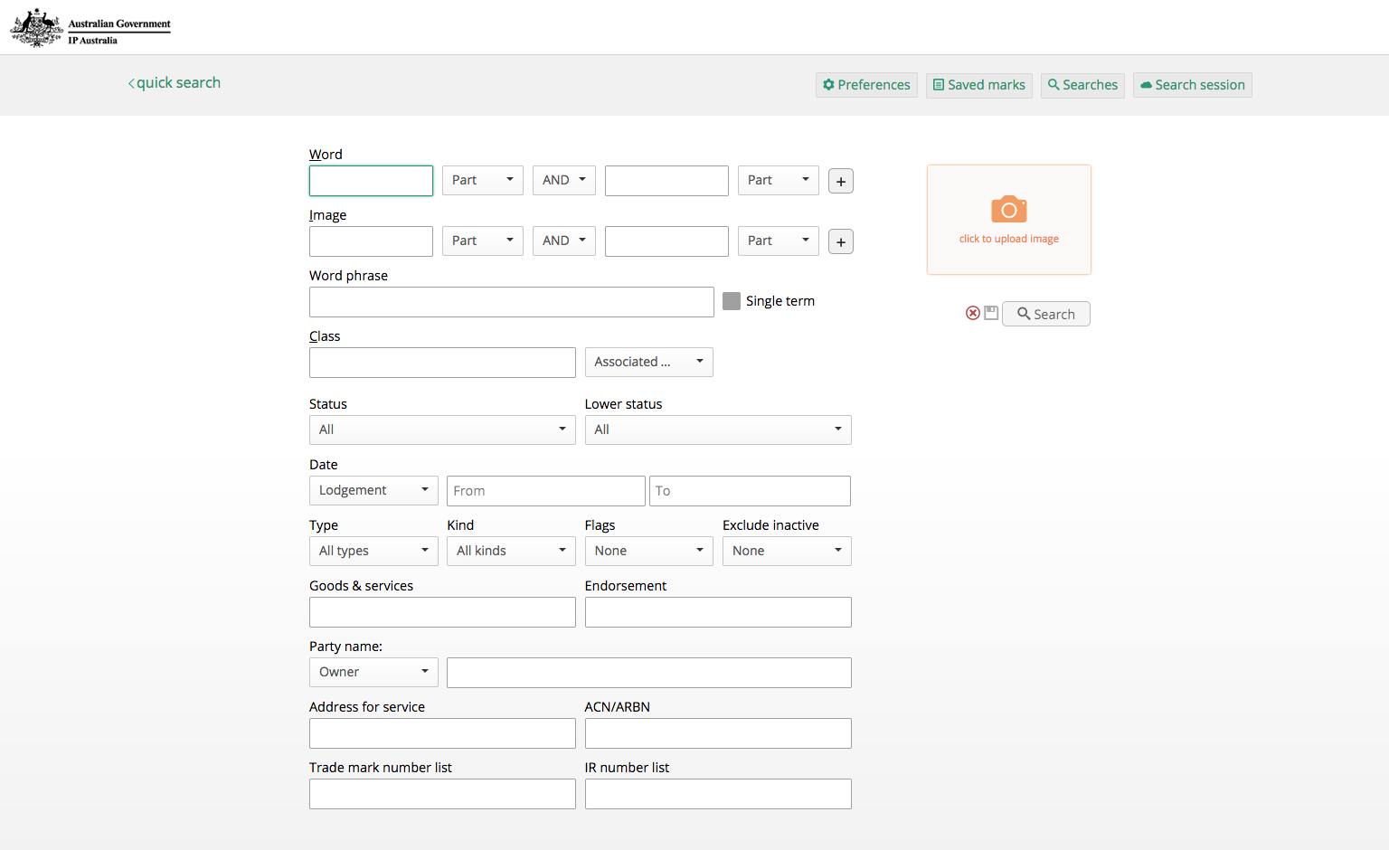
With a set of search pages for users to create their queries and search, we needed to move into the results pages, and views to display details of each result. We took a similar approach for all the different features, starting from the existing system we dug deeper into why certain functionalities ware made available to the users and explored how they could be improved and optimised in the new product.
Prototype
Developing the initial mockups into a functioning prototype was the natural next step for the project. Presenting the initial prototypes to the user groups, we discovered that even though they had been involved in designing the mockups and creating the new system all along, there were still a lot of nuances that only appeared as we made the system interactive.
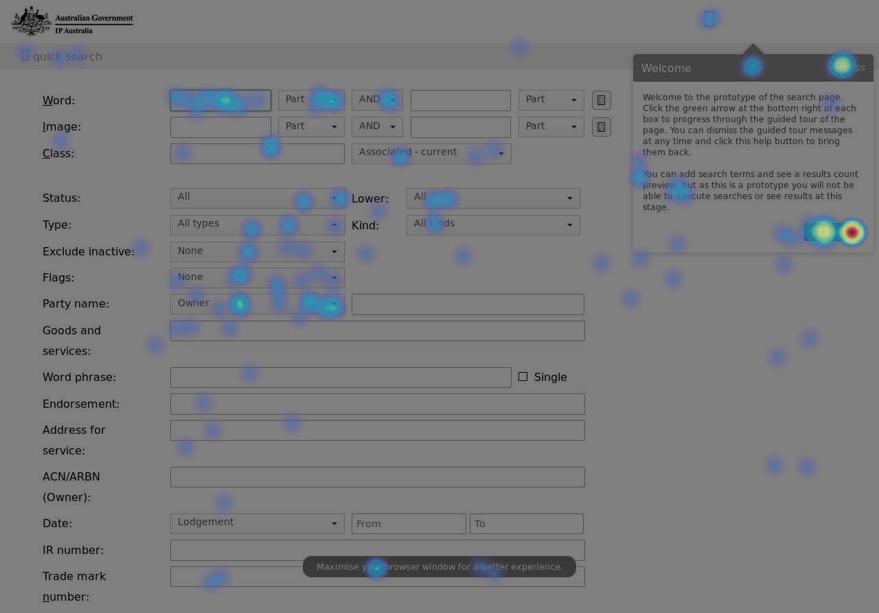
Capturing using behaviour using heatmaps to visualise where people move their cursors to and what they interact with turned out to be crucial, especially as we were developing a system for users that need to complete their work as quickly and efficiently as possible – we didn't have much room for unnecessary clicks.
Alongside catering for our target user base, we had to ensure we complied with the WCAG accessibility standards across the whole system. Up until that point, the mockups and the initial versions of the prototype system were only partly accessible – we ensured colors and sizes of the various elements on the page were compliant, however we didn't test for any keyboard operability or interaction using a screen reader.
Iterate & Improve
Even though the initial research phase ended as we started to move towards a more final product, we never stopped receiving feedback from users that needed slight variations of the functionality we implemented, for different use cases.
We developed the prototype so it was trivial to update both the look of the interface but also some of its major functionality. This way, if during prototyping we discovered that users were struggling with a particular part of the system, it would be simple for us to listen to their feedback and implement change. And the final system is no difference, we made sure to keep both the design language and the codebase as simple as possible, to ensure that changes coming from feedback would be easily fed into the system if and when needed.
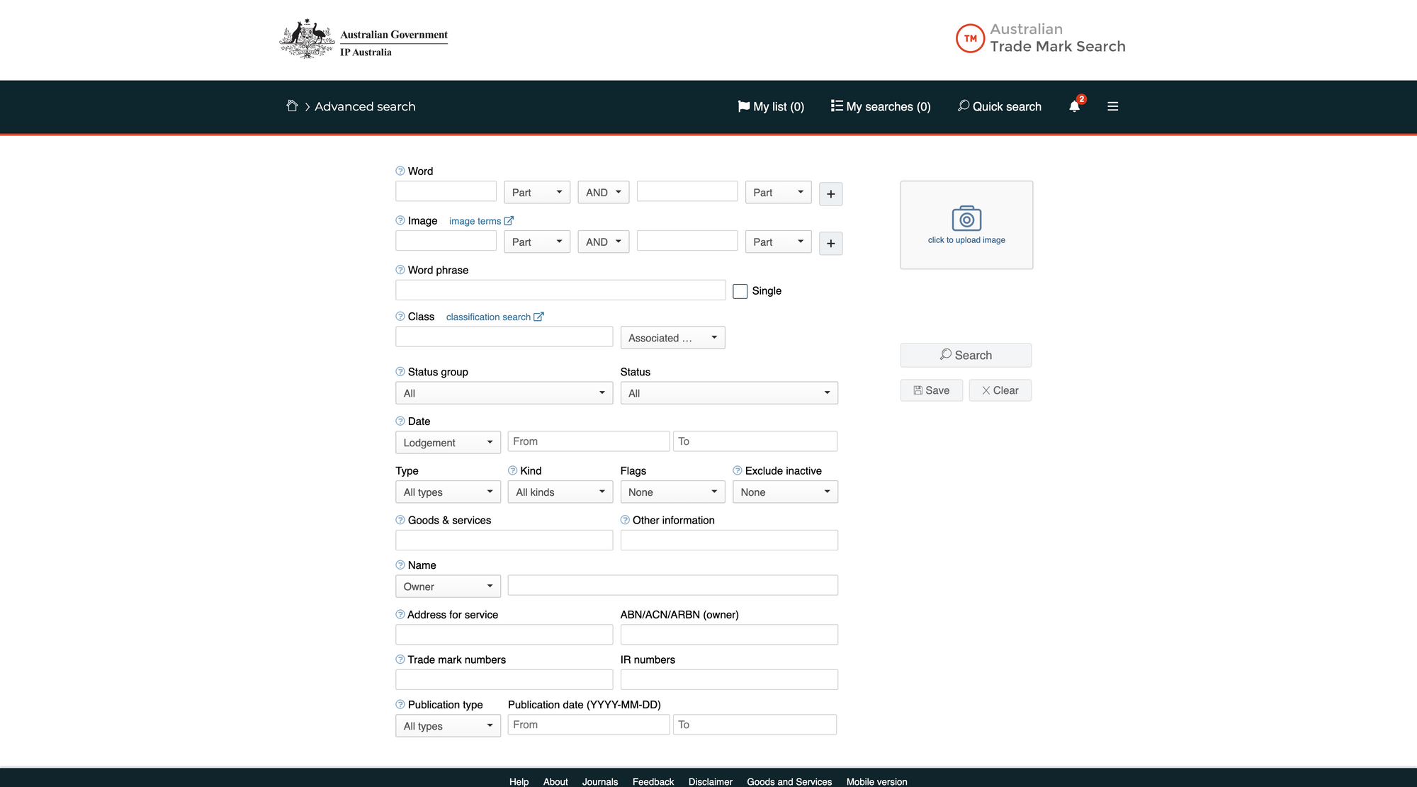
For example, this was one of the first systems designed at IP Australia that would follow the department's new branding guidelines. So, while during our early stages of design and prototyping, we focused on functionality and user experience, in later stages we started to update the UI of the platform to align with this new design. What we discovered was that keeping the system as transparent as possible, instead of cluttering the design with logos and other graphical elements, helped our users focus on our research question: as a user, what am I trying to find when searching on this system?
We knew this approach was important, as we were updating an existing search engine that has shaped how people learnt and developed their ways of searching – and we were trying to interfere with that as little as possible while making sure we were going to be able to switch to a new skin for the system whenever it was needed.
Repeat
As I mentioned earlier, the project scope didn't only involve one system – but two. This helped us along the way, as we moved from developing the search platform for Trade Marks to the one for Industrial Designs.
The Industrial Designs search system had been around for over 20 years and, as the one for Trade Marks, became a staple for people in the industry. It became clear we had to follow a very similar approach as we did with the previous system, reach out to our main audience and try to accomodate as many features as possible in the new platform.
The problem we were trying to solve was really similar, however the industrial design data is substantially different: What are people seeking to find when searching for industrial designs?
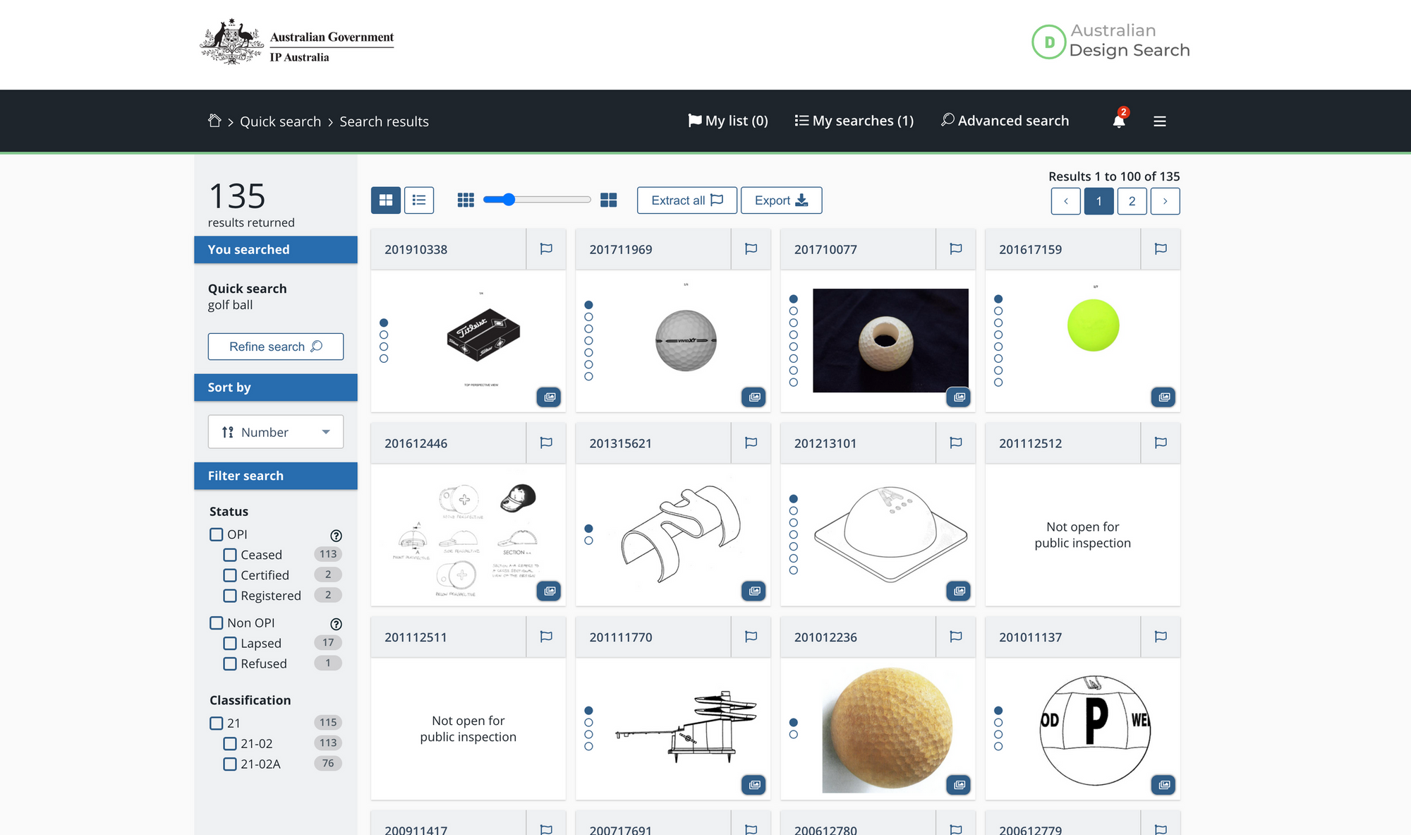
For example, something we noticed from early research was that users were largely interested in images – the representations that essentially describe an industrial design. Whilist in trade marks most data is textual, industrial designs are a lot more visual and we had to explore ways to highlight this part of the data.
We introduced a new view for the results page, where all results would be displayed in a grid that could be resized – with the option to also zoom into particular parts of a product. This solved a lot of the issues that existed in the old system: the way through wich users were able to access images, and how large these images now were – making searching for a particular result a lot more efficient.
Reflection
Designing specialized search systems is nothing like what I expected. Searching for information a way a computer does is not something we (humans) do or are good at. Designing a search system that interfaces us to complex data is very challenging.
Something that came clear to me from the beginning of this project is just how much depth there is to conducting a search. We've all used Google, you type in a word and it gives you what you wanted – most likely within the first 3-5 results. When you're designing and building a system that is designed to return 2,000 results that could be relevant to a user, suddenly the way the results are ordered, displayed and consumed matters more than anything. Moreover, supporting users that don't know what they are looking for is also extremely challenging.
We found that this problem can be solved by identifying two crucial parts:
- How do users construct a search query
- How do users consume the results that that query produced.
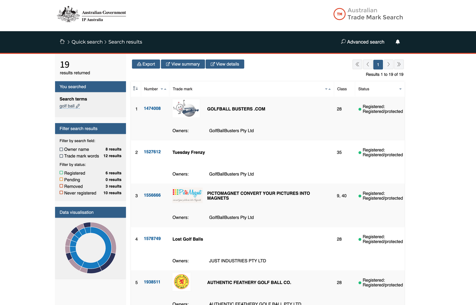
For example, we know that boolean operators, even though are in almost every sentence we say or type, are not really understood when creating complex queries to retrieve information out of a black box system – like the ones we were designing. Helping users in creating the ideal search query became crucial, we included features like a live count of how many results a search was going to return before clicking go and highlighted how many results matched a specific filter while looking at a long list of results to help solving this problem.
Comparing the data from the old systems, we found that a lot more concise and precise queries were now being submitted to the system, hopefully thanks to the fact that users are now able to know how much that they're about to consume when they click search. Designing two search pages, one only composed of a simple search bar – targeted at less experienced users, supported this too. We found that a large part of the audience can now complete queries much faster, simply by using this simplified search page.
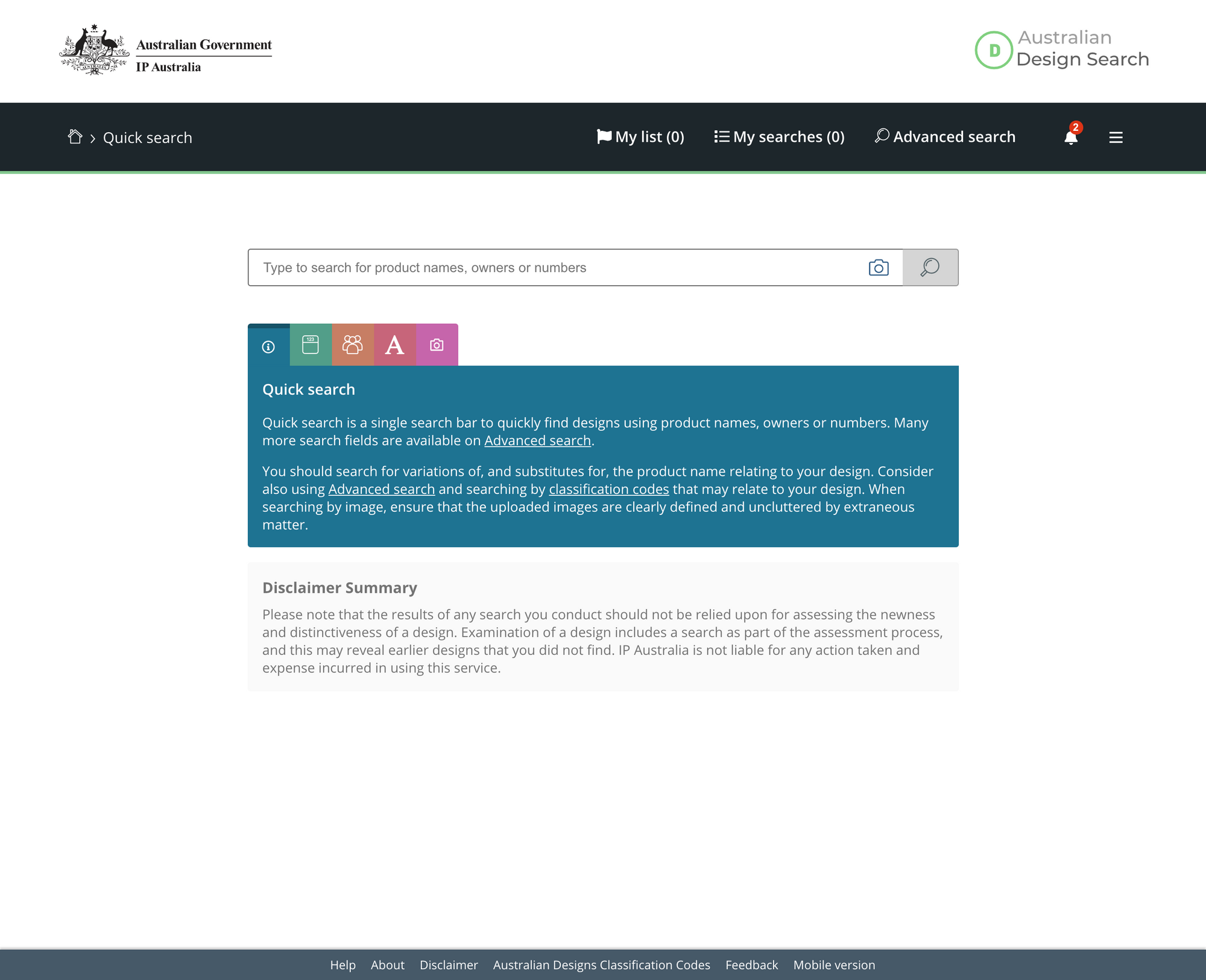
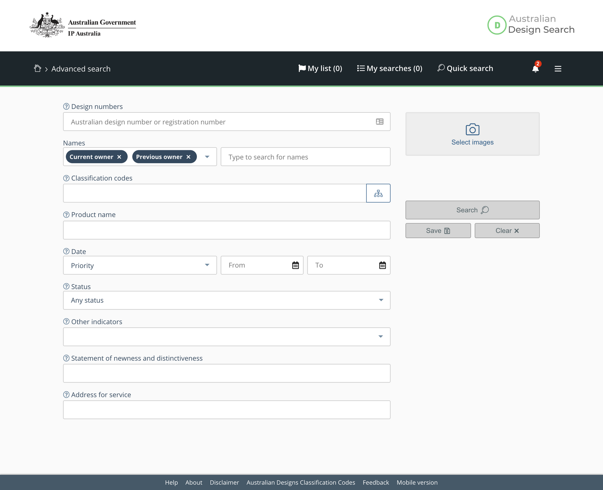
However, understanding what pieces of data are crucial for a results page and how to prioritise them so that both expert and novice users would be able to consume information produced by the search systems is a lot harder. A lot of times, this would depend on the circumstances, especially for expert users – so we introduced some minimal customisation options. To help less experienced searchers, we experimented with filters to suggest whether a set of search results is worth looking at or should be refined or changed to get better results.
To further help users that land on the results page not knowing what data they should be focusing on, and why, we defined some default ordering that would bring the most relevant results at the top and used indicators to highlight bits of information that are most likely relevant to the search you are conducting.
This challenging experience taught us that, especially when working is such complex and very techical spaces, it's crucial to focus on what the users are trying to achieve and what is the best way a well designed system can support that. We explored a variety of different avenues, for both systems, and what we landed on has been mostly defined by our user groups and enhanced by the knowledge and experience of both the design and business team.
We were developing systems that will most likely have a 10-20 years life span and had to include our core users along the way. We know we are saving the expert audience a lot of precious time when compared to the search engines we replaced – but, is this the furthest we could have gone to? What else could we have done to ensure all of our users are finding just what they're looking for? I believe, we will never know.