People first. We have all heard about collaborative design and how much products benefit from including potential customers in their design process. But have you ever thought of what it really means to be “inclusive” when it comes to designing for a platform like the web, that makes your product accessible from over all over the world?
Putting people first means being as inclusive as possible, and ensure the products we deliver are accessible by anyone. I know, as a designer, accessibility might not sound as one of the most sexy and exciting things out there, but let me try and change your mind…
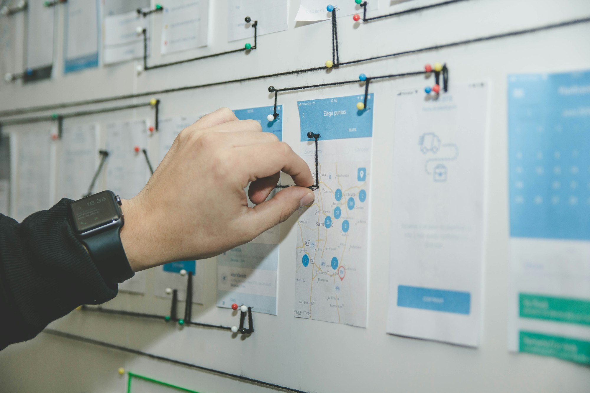
Flows
Accessibility testing taught us that, if the product we’re designing relies heavily on ensuring that a user goes from A to B to C to… Z without missing a step, it’s important to consider two main points: visibility of the navigation buttons, and quick access to them as they become available. These might seem very simple and intuitive points but often times we design without considering the fact that different browser configurations will most likely push the buttons out of their original place, hiding them. Many users are likely to surf the internet with their browser zoom set to any arbitrary value between 100 and 200%, making sure that your site is accessible (and your navigation visible) at double size is one of the simplest checks we, as designers, can do, to prevent users getting lost while using our products.

Users with mobility disabilities might be using unconventional navigation methods, such as a joystick or an eye tracking device. These devices track user’s motions and move the mouse on the screen, creating a seamless experience as if they were using an actual mouse… Most times these solutions are not very accurate and require a lot more work from the user operating them. Leaving enough margin around the elements on the page, might prevent mistakes and reduce effort.
Colors
In order to ensure content on the web is accessible, we need to carefully pick colours for our applications. The WCAG 2.0 guideline says content should have a minimum contrast of 4.5:1. Keeping this in mind when designing websites and application that rely heavily on text is crucial, as it might make it hard, if not impossible, for visually impaired people to navigate them.

Grey and blue, on white background, are the most commonly used colours to highlight links and describe images or for fields. It is important that these elements are readable by anyone, no matter their browser font size or zoom level.
Data input and forms
Most web applications require users to interact with some sort of input-like controls. The most accessible type of form on the web, as you can imagine, is the standard HTML form, with its field-sets, labels, placeholders, buttons, and so on…
But there are a few tricks you can use to make your fancy forms as accessible as the ones defined in the standards, without losing any of your style. W3C has developed WAI-ARIA, the standard for Accessible Rich Internet Application and included a whole suite of properties that transform any valid HTML element into a fully accessible element.
WAI-ARIA includes properties to transform any HTML element into a menu with a hidden sub-menu, so you can create your own select input and still be able to make sure its 100% accessible, with only a few additions to your code. And it’s that simple that there should be no reason not to consider doing it the next time you implement a form with custom elements.

If forms are an easy-fix, the same cannot be said for web apps that use flows or processes. Depending on the nature of your app, you might have content coming into view from different sides of the screen, or slide through as users fill up a wizard application, or fade in or out, when some data changes on the page.
So… Is that it?
Well, this is a good start.
Keep these principles in mind when designing and developing and make sure to try out your app only using your keyboard. And, as a little exercise, iterate over the navigation of your apps until you find that you can complete every path without a single click. It will cost you some sweat to begin, but it will make you feel really rewarded! 👍✨
This post was originally published on Medium, on the January 28, 2018.